Accessible Email: How to Meet WCAG Color Contrast Standards
If you’re sending marketing emails in 2025, making sure it’s an accessible email isn’t just a nice-to-have—it’s a must.
Here’s what you need to do:
Make your emails easy for everyone to read.
Sounds like a no-brainer, right?
Of course, you’d want everyone to be able to read your emails.
But what’s easy for you to read might be totally different for your next-door neighbor. That’s where accessible email comes in.
The official standards are called the Web Content Accessibility Guidelines (WCAG)—basically the rulebook for making websites, apps, and emails work for people with disabilities.
Don’t worry, we’re sticking to email today.
There are 13 best practices to follow when building an accessible email. Today, we’re focusing on one of the easiest to fix: color contrast.
Before we dive in, let’s quickly talk about who should be paying attention to this stuff.
Who Should Prioritize Accessible Email and WCAG Guidelines?
You might be wondering…do these rules actually apply to your business?
Here’s the short version:
WCAG isn’t a law—but it is the standard.
The WCAG guidelines aren’t laws by themselves, but they’re used all over the world as the go-to standard for digital accessibility. Whether you’re in the U.S., Canada, or the EU, WCAG is what most laws point to.
While the Web Content Accessibility Guidelines (WCAG) 2.2 are not laws themselves, they are widely recognized as the benchmark for accessibility compliance. These guidelines are referenced by various legal mandates, including the Rehabilitation Act, the Americans with Disabilities Act (ADA), and other international laws.
Note: At the time of writing this, the current version is WCAG 2.2, which was published in October 2023. You can review WCAG 2 here.
Here’s How It Breaks Down:
- U.S. – Section 508: Federal agencies and their contractors have to follow WCAG 2.2.
- U.S. – ADA Title III: The ADA doesn’t list WCAG by name, but the DOJ has referenced it in enforcement cases—especially for businesses that serve the public.
- Canada – AODA: Ontario law requires public-facing businesses to follow WCAG 2.0 AA.
- EU – EAA: The European Accessibility Act requires most public-facing digital content to meet WCAG standards.
Rule of Thumb: If your business serves the public online, following WCAG 2.2 AA is your safest (and smartest) bet.
(And just a heads-up—I’m not a lawyer. Just someone who builds emails every day.)
Why an Accessible Email Matters
This isn’t about ticking a box.
This is about creating accessible emails ensures your message reaches subscribers who might otherwise struggle to read your message.
Here’s why it’s important:
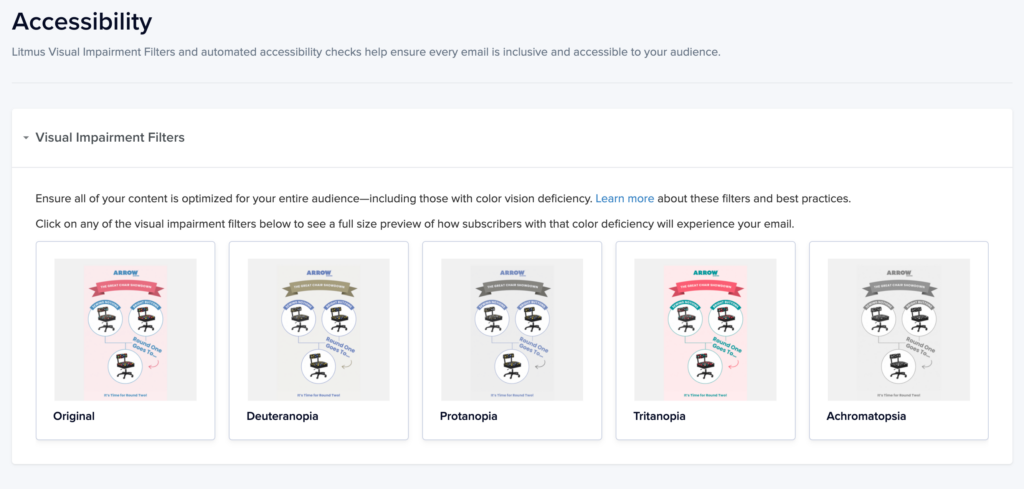
- 1 in 12 men and 1 in 200 women have color blindness.
- Conditions like glaucoma (affecting 4.22 million people in the United States), cataracts, and macular degeneration make low-contrast text tough to read.
- Older readers naturally lose contrast sensitivity as they age.
If your text and background colors blend together, a significant portion of your audience may have difficulty engaging with your emails.
And if that’s not enough to convince you, think of it this way: If your text is hard to see against your background (visual impairment or not), people will skip it, no matter how good your content is.
Let’s Talk About Color Contrast
Let’s start with the most common—and easily corrected—email accessibility issue: color contrast.
Contrast makes your text stand out from the background. The bigger the difference between your text and background, the easier it is to read.
Think dark text on a light background or light text on a dark background.
What You’re Aiming For
- Regular-size body text (14px): At least 4.5:1 contrast
- Larger or bold fonts (18px+): At least 3:1 contrast
Note on font size: The px (pixel) and pt (point) sizes are different, so be sure to confirm which unit you are using. For example, template editors in Klaviyo or Mailchimp measure font sizes in pixels (px).
For example, the classic black text on a white background gives you a 21:1 ratio. But a cream text (hex color #e7d1c1) on a white background gives you a 1.46:1 ratio.
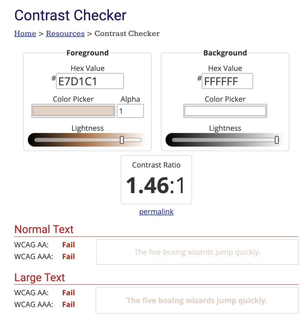
To quickly check whether your color combo meets the required ratio, tools like the WebAIM Color Contrast Checker let you plug in your hex codes and see if they pass.
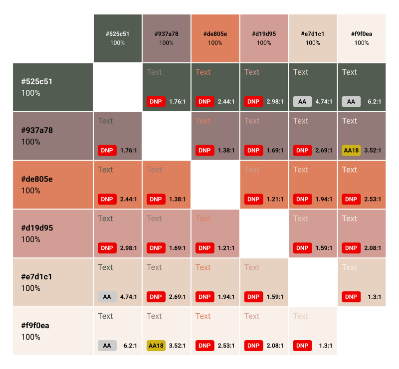
Pro Tip for Accessible Email Color Use
Don’t want to double-check colors every time you send an email?
Create a cheat sheet of your brand colors that meet WCAG contrast ratio standards. Share it with your designers, developers, and email team. Boom—instant clarity.
Need an example? Check out my approved colors chart.
Takeaway
Accessibility isn’t just about checking a box. It’s about being inclusive and ensuring your message reaches as many people as possible.
And honestly? A well-designed, accessible email looks great and performs better.
In future editions, I’ll be diving into other email accessibility tips—but if you only take one thing away from today, let it be this:
High contrast = high impact.
If accessibility isn’t baked into your design process, you’re likely missing out on potential customers.
Learn it once, integrate it into your process, and make accessibility part of your quality checks.

References
- 1. “About Colour Blindness,” Colour Blind Awareness, accessed April 12, 2025, https://www.colourblindawareness.org/colour-blindness/.
- 2. “Glaucoma Facts and Stats,” Glaucoma Research Foundation, last updated March 12, 2025, https://glaucoma.org/articles/glaucoma-facts-and-stats.
Website Design by Shelby Design Co
© 2025 LJ Strategies LLC. All right reserved.
Privacy Policy
Terms of Service
Disclaimer